What a difference the data makes!


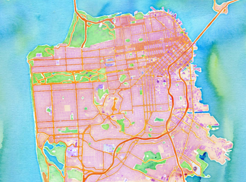
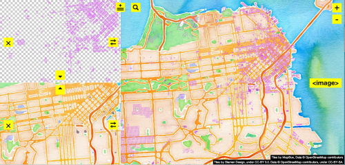
Tonight I’m playing around with map things. First, I discovered that within a shapefile there is really and truly data! The top image is produced in QGIS, simply by opening this data file and then turning on the Stamen watercolor layer. No alignment needed! (But here is the necessary attribution to Watercolor: Map tiles by Stamen Design, under CC BY 3.0. Data by OpenStreetMap, under CC BY SA.)
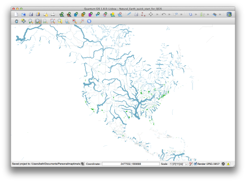
Notes: 6.11.13 meetup + getting started with QGIS
Last Thursday, a few of us gathered at the Stamen office to free form learn mapmaking. For about 2 hours, we sat together listening to music and working on mapmaking projects. Most of the people in the group are just learning how to make maps (Camille, Kristina, me). Mike and Chris know more and helped us a lot, which was great, especially considering that the very first steps of getting a map editor up and running can be a little cumbersome. Without Chris, I may still be hunting for links.

Here are the steps Chris shared with me, which will help get you up and running (if you have Mac).
Notes from State of the Map
One week ago marked the beginning of what would be a transformational experience at State of the Map, The conference was filled with so many great people drawn together by their love of maps and Open Street Map in particular.
Although I studied digital map design in grad school (mapping fruit trees on an Android), the focus required using the Google Maps API. That is but one of many ways to create a map, and even more ways to visualize data. The path of learning mapmaking is in many ways just beginning. Starting here.
